


If you just asked yourself, “What the heck is that? Some kind of dinosaur?” … I like you. I really, really like you.
The Thesaurus Rex – something that should have died out along with the rest of the dinosaurs. Say ‘thesaurus’ three times fast. You can’t? Me either. That’s just one of the reasons I don’t use one and don’t think you should either. There’s one exception – one good use for the thesaurus. But first, you need to know why you shouldn’t use one.
- ‘Thesaurus’ is really hard to say. You don’t want to get tongue tied and embarrassed asking your colleague to hand you that thesaurus. Pleathe and thank you. If you’re reading this out loud to someone next to you, I know that right now … you understand completely.
- Using the most simple, common, familiar word is always your best bet. There’s nothing more annoying than having to stop in the middle of reading to look up a word in the dictionary. Not only do you suddenly feel inferior to the author, but you also lost your train of thought, and probably your interest in whatever you were reading.
- There is absolutely nothing wrong with using the same word more than once, especially if you’re just trying to get your message across. Ex. We built our new home in 2014; it was constructed with both beauty and comfort in mind. You can use both ‘built’ and ‘constructed’, but I promise, you really don’t have to.
When is it a good time to use a thesaurus? I go to it when I just can’t seem to come up with the right word. The word I’m using is ok, but not quite on target. In that case, I visit www.thesaurus.com type in the word I was originally using, and search for the ideal word.
And by the way, I still choose a word that’s both common and familiar.

 There just so happens to be a number of tricks up our sleeves at ClearWorks. Writing for readers at risk of literacy and language difficulties is easily accomplished when you know exactly what you’re dealing with. Years of experience in adult literacy programming taught us precisely how to write for new readers. When it comes to website content, we choose our words carefully and use our space wisely, so even the most reluctant readers can get to the point.
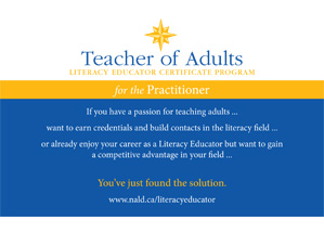 At ClearWorks, the overriding belief is that clarity counts! If you’re looking to attract an audience, your message has to be clear, concise, simple, and brief. And, it has to speak to your reader by answering questions and offering solutions. So ClearWorks assembled two creations – one for potential students, the other for the managers or supervisors with professional development dollars to spend. Eye-catching, inexpensive to mail and suitable to email, the marketing materials opened to a poster attractive enough to place front and centre on any corkboard. Ready to sign up? According to the poster, it’s easy!
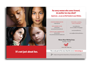 For ClearWorks, the challenge was obvious. There are so many messages out there. So many causes, so many appeals for support. For broad appeal, this message simply had to be a quick read. Other communities had tackled similar projects and were left with lengthy, text-heavy reports that were meticulous in detail and rich in content, but time consuming to read. We had to differentiate ourselves. So we did just that, with an eye-catching and eyebrow raising brochure that fits in the palm of your hand but folds out to an inviting poster that sends you straight to the WAWG website for the answers to all the questions you suddenly have. ClearWorks authored the wealth of fresh content that rests on the site and stands the test of time with continual updates. Now that’s a cause worth caring about.
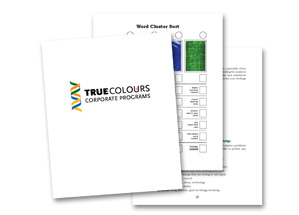 Recognizing that simplicity of the messaging was key, ClearWorks produced a Clarity Version of the True Colours corporate training materials. While keeping the messaging intact, changes to style, vocabulary, layout, colour, and font made all the difference. And by maintaining the overall look of the original materials, ClearWorks designed a simplified version that, at a glance, looked identical to the original. The purpose? To ensure participants are offered the version that best suits their individual literacy levels, without singling out those who struggle with language more than others. Problem solved.
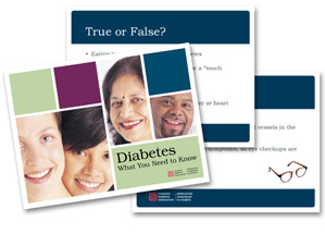 Of course you can. ClearWorks analyzed each of the Signature Presentations, examining the language choices, organization, and overall clarity of the work. And slide by slide, word by word, the new presentations came to life. Even the templates, images, and speaker notes were updated, bringing the clarity of the presentations to a new level. Professional, relevant, and appropriate for any audience, these national presentations are a source of pride for our leading authority on diabetes in Canada, and around the world.
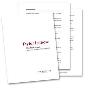 Since each of Taylor Leibow’s reports were individualized, it wasn’t possible to create a standard template. Instead ClearWorks looked at strategies that would allow Taylor Leibow to create uncomplicated, well-organized reports that clients could understand and lawyers could scan quickly for the crucial details they need. After careful analysis of sample reports, ClearWorks responded with a Clarity Report for each of the Economic Loss and Business Valuation Reports. Filled with itemized recommendations about edits to language and style, coupled with thorough re-writes to clearly demonstrate the suggestions, these Clarity Reports combined with ClearWorks’ ongoing support allows Taylor Leibow to put Clear Writing theory into practice.